Paint It Black
Paint It Bold – Your Complete Guide to Color Drenching
The Problem: Are Your White Walls Making You Yawn?
Have you walked into your home lately and felt… nothing? If your all-white walls are making your space feel cold, empty, and a bit boring, you’re not alone. According to a survey of 154 interior designers by Apartment Therapy in 2024, color drenching was one of the trends designers aren’t ready to say goodbye to, and for good reason.
Many people think white walls are the safest choice. But here’s the truth: design expert Emily Henderson warns that white paint only works well in rooms with lots of natural light – without that light bouncing around, white rooms can look flat and lifeless.
The good news? There’s a bold, beautiful solution that’s taking over homes in 2025, and it might surprise you.
What Is Color Drenching?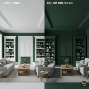
Color drenching means painting every surface in a room the same color – not just the walls, but also the doors, ceiling, shelves, and trim. Think of it like wrapping your room in a warm, colorful blanket.
Instead of painting your walls one color, your ceiling white, and your trim a different shade, you pick one color you absolutely love and use it everywhere. It’s that simple!
According to interior designer Tiffany Gowler, color drenching simplifies the design process by eliminating the need to coordinate multiple colors while still making a strong design statement.
Breaking the Big Myth: Do Dark Colors Make Rooms Smaller?
Here’s where things get interesting. You’ve probably heard that dark colors make rooms look tiny. But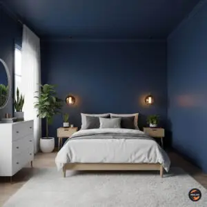 guess what? That’s not exactly true!
Research on human perception dating back to 1898 has consistently found that bright objects appear closer and larger than the same objects in darker colors. This means dark colors actually make walls recede or pull back, not close in on you.
Think of it this way: Imagine you’re looking at a stage in a dark theater. The black walls seem to disappear into the background, right? Interior designer Michael Helwig explains that when you paint a small room dark and use light-colored furniture, the dark walls expand and blur, while the light furniture pops and adds dimension to the space.
So dark colors don’t shrink your room – they can actually make it feel larger by making the walls seem to fade away!
Important note: If you have a room with very little natural light and small windows, a very dark color might make it feel smaller, so good lighting is important.
The Cocooning Effect: Why Dark Rooms Feel So Good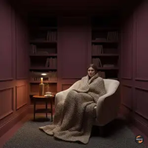

Have you ever noticed how cozy a blanket fort feels? Or how nice it is to snuggle up in a dark movie theater? That’s the “cocoon effect” in action.
Interior designer Letecia Ellis Haywood notes that people are craving moody and cozy spaces, and color drenching creates a cocoon-like feel that helps rooms feel safer and more intimate.
When every surface is the same deep, rich color, your room becomes like a comfortable hug. The color wraps around you, making you feel protected and relaxed. It’s especially wonderful in bedrooms, where you want to feel calm and peaceful.
Top Colors for 2025: What’s Trending Now
If you’re wondering what colors to choose, here are the most popular shades for 2025: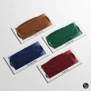
Mocha Mousse – Pantone’s 2025 Color of the Year, Mocha Mousse (17-1230), is described as a warming brown hue that nurtures with its suggestion of chocolate and coffee, appealing to our desire for comfort. It’s like painting your walls the color of your favorite hot chocolate!
Midnight Blue – Deep blue creates a calm, peaceful feeling. Blue shades are excellent choices for relaxing spaces and bedrooms because they help promote a sense of calm.
Forest Green – Rich green colors bring the outdoors inside and make spaces feel natural and grounding.
Burgundy – One homeowner reported that painting their bedroom a rich burgundy color created a more intimate, romantic feel while also making the space feel much larger.
Design experts are also forecasting earth tones to dominate in 2025, with people choosing warmer and deeper colors including dreamy blues, deep reds, and rich greens.
Choosing the Right Paint Finish: Matte, Eggshell, or Satin?
The type of paint finish you choose is just as important as the color itself. Here’s what each finish does: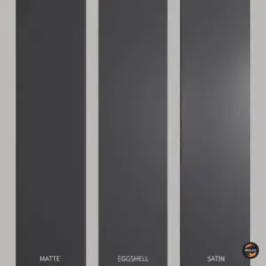
Matte Finish: This has no shine at all. It makes colors look super rich and deep, but it can show marks more easily. Best for bedrooms and living rooms where people won’t touch the walls much.
Eggshell Finish: This has just a tiny bit of shine, like the shell of an egg. It’s easier to clean than matte and still looks soft and sophisticated. Great for most rooms in your house.
Satin Finish: This has a gentle glow when light hits it. It’s the easiest to clean and works well in bathrooms and kitchens where walls might get splashed or dirty.
Lighting Your Dark Space: Why It Matters More Than Ever
When you paint a room dark, lighting becomes your best friend. Here’s why: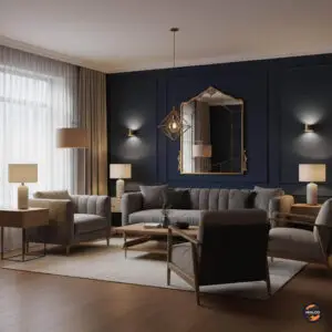
Dark colors soak up light instead of bouncing it around like white walls do. This means you need to plan your lighting carefully to make sure your room doesn’t feel like a cave.
Tips for Lighting Dark Rooms:
- Use Multiple Light Sources: Instead of one overhead light, add table lamps, floor lamps, and wall lights in different corners of the room.
- Choose Warm Bulbs: Warm-colored light bulbs (not the super white ones) make dark rooms feel cozy instead of cold.
- Add Mirrors: Mirrors reflect light around the room, which helps brighten things up naturally.
- Consider Natural Light: If your room has windows, don’t block them with heavy curtains. Use sheer curtains that let sunlight in while still giving you privacy.
Creating Interest with Texture Instead of Color Contrast
When everything is the same color, you might wonder: Won’t it be boring? Not if you use different textures!
Incorporating natural materials like wooden floors and rattan furniture adds interest while softening the look, without breaking up your one-color scheme.
Ways to Add Texture:
- Wood Elements: Wood furniture, floors, or shelves add warmth and natural beauty
- Velvet Fabrics: Soft, touchable velvet pillows or chairs catch the light beautifully
- Metal Accents: Brass, gold, or silver picture frames and light fixtures add sparkle
- Natural Materials: Rattan furniture, pebbles, or natural stonework create depth within a block of color
- Different Fabrics: Mix smooth cotton, fuzzy wool, and silky materials for visual interest
Think of it like this: Even though chocolate cake is all brown, it’s still interesting because of the different layers – the fluffy cake, smooth frosting, and maybe some crunchy nuts on top!
The “Half-Drench” Technique: For the Hesitant
Not ready to go all-in with one color everywhere? Try the “half-drench” or two-tone technique!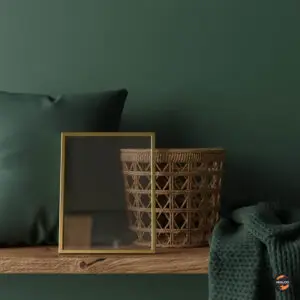
Wainscoting Approach: Paint the bottom half of your walls (up to about waist height) in your bold color, and keep the top half lighter. This gives you the richness of a dark color without feeling overwhelming.
Two-Tone Variation: Designer advice from The Everygirl suggests that color drenching is moving toward “double drenching,” where people paint walls in one shade and ceilings and architectural details in the next lighter or darker shade from the same color family.
This is perfect if you love the idea of color drenching but want to ease into it slowly. You can always paint the rest of the room darker later if you love how it looks!
Psychology of Deep Colors: Which Shades Do What?
Different colors affect how you feel, so choose wisely based on what you want from each room: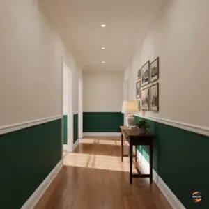
Blues and Greens: These colors calm your mind and help you relax. Perfect for bedrooms where you want to sleep well, or bathrooms where you want a spa-like feeling.
Reds and Burgundies: These warm colors make spaces feel intimate and are great for dining rooms where you want people to feel connected and talk to each other.
Browns and Warm Neutrals: These grounding colors make you feel safe and comfortable. They work well in living rooms and family spaces.
Deep Grays and Charcoal: These sophisticated colors create a modern, elegant feeling. Great for home offices or spaces where you want to feel focused.
Step-by-Step Application Tips
Ready to paint? Here’s how to do it right: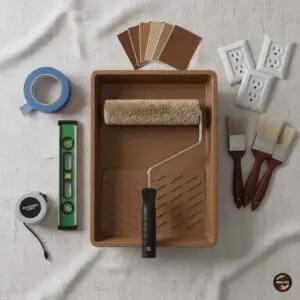
- Test Your Color First: Paint large samples (at least 12 inches by 12 inches) on different walls and look at them for a full day. Colors look different in morning light versus evening light!
- Prep Your Space: Remove all furniture you can, and cover what stays with protective sheets. Take off outlet covers and light switch plates.
- Start with the Ceiling: Always paint from top to bottom. Do your ceiling first, then walls, then trim and doors.
- Don’t Forget the Details: Paint everything the same color – yes, even:
- Radiators
- Outlet covers
- Door frames
- Window trim
- Baseboards
- Use Quality Paint: Good paint costs more but covers better, looks richer, and lasts longer. You’ll need fewer coats and get better results.
- Apply Multiple Thin Coats: Two or three thin coats of paint look much better than one thick, gloppy coat.
Best Rooms for Color Drenching
Interior designer advice suggests that rooms that are enclosed by four walls are best for color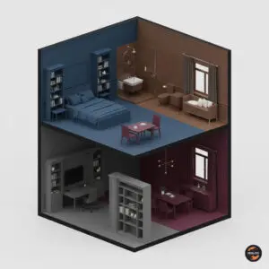 drenching, creating a cozy and intimate atmosphere. Here are the top choices:
Bedrooms: Perfect for creating a restful, peaceful space where you can escape from the world.
Bathrooms: Especially small powder rooms – color drenching works wonderfully in powder rooms and hallways.
Home Offices: A dark, focused space can help you concentrate and get work done.
Dining Rooms: Rich colors make dinner parties feel special and elegant.
Avoid: Large, open-concept areas where the immersive effect of color drenching can get lost.
Your Perfect Solution: Making It Work for You
Color drenching isn’t just a trend – it has deep roots in design history, from dramatic Victorian-era rooms to the monochrome magic of the 1970s and 1980s. It’s a timeless technique that keeps coming back because it works so well.
The best part? You don’t need to spend a fortune. Paint is one of the most affordable ways to completely transform a room. For the cost of a few gallons of paint and some rollers, you can create a space that feels expensive, custom-designed, and uniquely yours.
Remember: Your home should make you happy. If you love a color, use it! As painting expert Mike Katounas reminds us, “You are the ones who live in space. You should choose colors you love”.
Final Thoughts
Color drenching is about being brave enough to surround yourself with colors that make you smile. It’s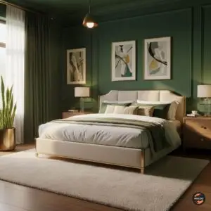 about creating a home that feels like a warm hug instead of a sterile doctor’s office.
The interior design trends of 2025 prove that homes are no longer about playing it safe – they’re about telling a story and embracing creativity, sustainability, and comfort with a bold, personal edge.
So pick that beautiful deep blue you’ve been dreaming about. Choose that rich forest green that reminds you of peaceful walks in nature. Go for that cozy brown that feels like your favorite coffee shop.
Paint your walls, your ceiling, your trim – everything. Then add some comfy furniture, good lighting, and personal touches that make you happy.
Your home will thank you by becoming the cozy, beautiful, uniquely-your space you’ve always wanted. And every time you walk in, you’ll feel that little spark of joy that comes from living in a place that truly feels like home.
Watch Paint It Black (or Blue) Video